dir.create(path = "data")
dir.create(path = "output")Introduction to R Graphing
This brief tutorial will demonstrate how to create a basic plot in R from a text file of data. This introduction provides an entry point for those unfamiliar with R (or a refresher for those who are rusty). We will start with a very minimal piece of code and work our way up to code that automates the creation of 12 different PDF files, each with a different X-Y scatterplot.
Learning objectives
- Gain familiarity with R
- Read data from a file
- Visualize data in a graph
- Understand the principle of control flow
In this tutorial, we will be using the ‘gapminder’ dataset, available here: http://tinyurl.com/gapminder-five-year-csv (right-click or Ctrl-click on link and Save As…). Make sure to save it somewhere you can remember (like your Desktop), as we will need to move it later.
Setup
First we need to setup our development environment. Open RStudio and create a new project via:
- File > New Project…
- Select ‘New Directory’
- For the Project Type select ‘New Project’
- For Directory name, call it something like “r-graphing” (without the quotes)
- For the subdirectory, select somewhere you will remember (like “My Documents” or “Desktop”)
We need to create two folders: ‘data’ will store the data we will be analyzing, and ‘output’ will store the results of our analyses. In the RStudio console:
Finally, move the file you downloaded (gapminder-FiveYearData.csv) into the data folder you just created. This is best accomplished outside of RStudio, using your computer’s file management system.
Your first plot
Plot the points!
# Read in data
all_gapminder <- read.csv(file = "data/gapminder-FiveYearData.csv",
                          stringsAsFactors = TRUE)
When reading data into R, it is always a good idea to make sure you read in the data correctly. There are a number of ways to investigate your data, but three common methods are:
headshows us the first 6 rows in a data frame.str(structure) provides some information about the data stored in the data frame.summaryprovides even more information about the data, including some summary statistics for numerical data.
# Investigate data
head(all_gapminder)
country year pop continent lifeExp gdpPercap
1 Afghanistan 1952 8425333 Asia 28.801 779.4453
2 Afghanistan 1957 9240934 Asia 30.332 820.8530
3 Afghanistan 1962 10267083 Asia 31.997 853.1007
4 Afghanistan 1967 11537966 Asia 34.020 836.1971
5 Afghanistan 1972 13079460 Asia 36.088 739.9811
6 Afghanistan 1977 14880372 Asia 38.438 786.1134str(all_gapminder)'data.frame': 1704 obs. of 6 variables:
$ country : Factor w/ 142 levels "Afghanistan",..: 1 1 1 1 1 1 1 1 1 1 ...
$ year : int 1952 1957 1962 1967 1972 1977 1982 1987 1992 1997 ...
$ pop : num 8425333 9240934 10267083 11537966 13079460 ...
$ continent: Factor w/ 5 levels "Africa","Americas",..: 3 3 3 3 3 3 3 3 3 3 ...
$ lifeExp : num 28.8 30.3 32 34 36.1 ...
$ gdpPercap: num 779 821 853 836 740 ...summary(all_gapminder) country year pop continent
Afghanistan: 12 Min. :1952 Min. :6.001e+04 Africa :624
Albania : 12 1st Qu.:1966 1st Qu.:2.794e+06 Americas:300
Algeria : 12 Median :1980 Median :7.024e+06 Asia :396
Angola : 12 Mean :1980 Mean :2.960e+07 Europe :360
Argentina : 12 3rd Qu.:1993 3rd Qu.:1.959e+07 Oceania : 24
Australia : 12 Max. :2007 Max. :1.319e+09
(Other) :1632
lifeExp gdpPercap
Min. :23.60 Min. : 241.2
1st Qu.:48.20 1st Qu.: 1202.1
Median :60.71 Median : 3531.8
Mean :59.47 Mean : 7215.3
3rd Qu.:70.85 3rd Qu.: 9325.5
Max. :82.60 Max. :113523.1
Because we are only interested in graphing data from 2002, we just pull out those data.
# Subset data, retaining only those data from 2002
gapminder <- all_gapminder[all_gapminder$year == 2002, ]
Last but not least, we use the plot function to draw the plot.
# Plot points
plot(x = gapminder$gdpPercap,
     y = gapminder$lifeExp)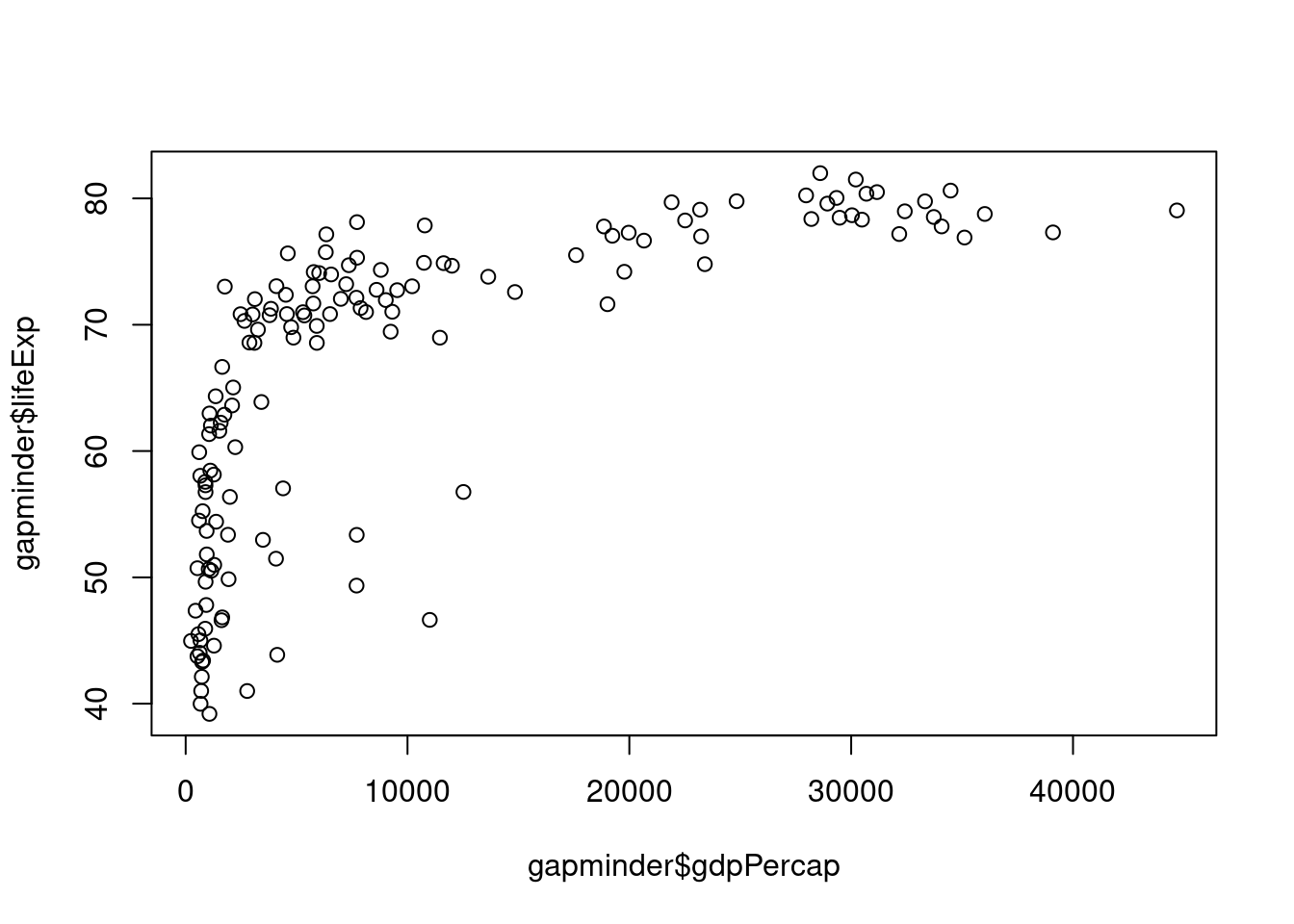
Make it pretty
Before we get to the next step we need to start using scripts, rather than typing directly into the console. This is the ideal way to save your work. You can create a new script in RStudio via File > New File > R Script (or the shortcut Ctrl+Shift+N / Cmd+Shift+N). Name the script something like “r-graphing.R” (without the quotes) - you will have to add the .R extension when you name the file. At the start of every script you write, you should provide at least this basic information:
- A brief description of what the script does
- Your name
- Contact information
- Date
Fix those axes titles
Our original graph was a good start, but those axis labels are pretty unseemly.
We can fix those up by setting values in the plot function call. Namely, we will be passing values to the main, xlab (x-axis label), and ylab (y-axis label) parameters.
# Graphing Life Expectancy vs. GDP
# Jeffrey C. Oliver
# jcoliver@email.arizona.edu
# 2016-11-15

# Read in data
all_gapminder <- read.csv(file = "data/gapminder-FiveYearData.csv",
                          stringsAsFactors = TRUE)

# Subset data
gapminder <- all_gapminder[all_gapminder$year == 2002, ]

plot(x = gapminder$gdpPercap,
     y = gapminder$lifeExp,
     main = "Life expectancy v. GDP",
     xlab = "GDP Per capita",
     ylab = "Life expectancy (years)")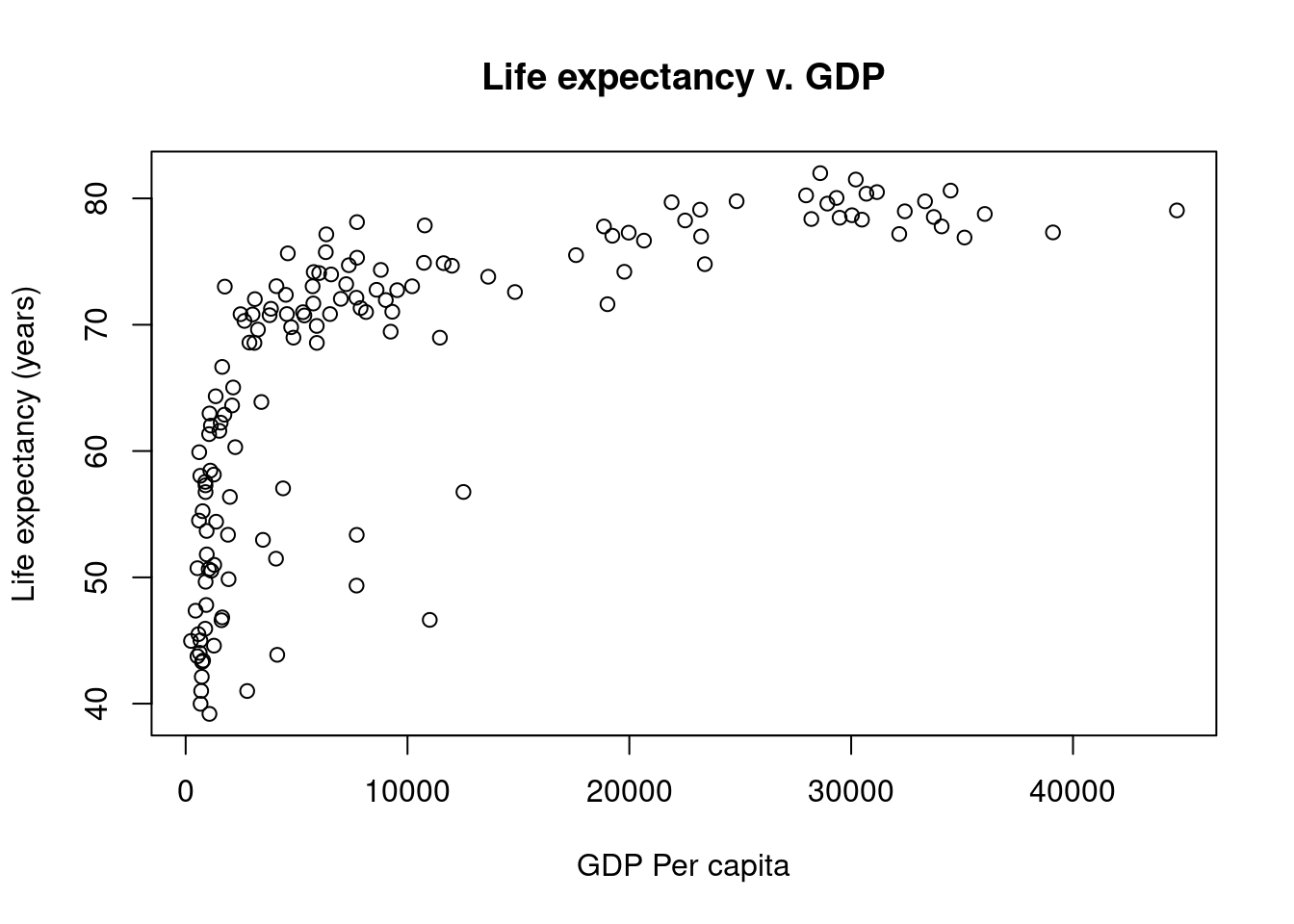
Changing scales
Log-transform data
This does not look like a linear relationship, but we can try a simple log-transformation on the GDP data to see how that looks.
# Graphing Life Expectancy vs. GDP
# Jeffrey C. Oliver
# jcoliver@email.arizona.edu
# 2016-11-15

# Read in data
all_gapminder <- read.csv(file = "data/gapminder-FiveYearData.csv",
                          stringsAsFactors = TRUE)

# Subset data
gapminder <- all_gapminder[all_gapminder$year == 2002, ]

# Make new vector of Log GDP
gapminder$Log10GDP <- log10(gapminder$gdpPercap)

plot(x = gapminder$Log10GDP,
     y = gapminder$lifeExp,
     main = "Life expectancy v. GDP",
     xlab = "Log(GDP Per capita)",
     ylab = "Life expectancy (years)")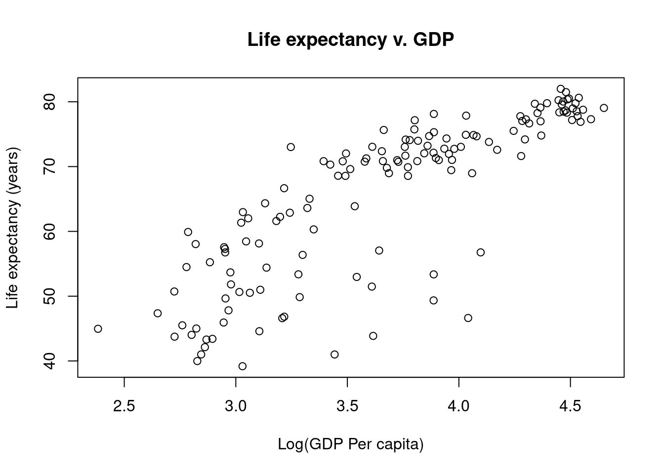
Make it prettier
Color the points
We are not restricted to black and white colors. Here we will color points by the continent each country is located on.
# Graphing Life Expectancy vs. GDP
# Jeffrey C. Oliver
# jcoliver@email.arizona.edu
# 2016-11-15

# Read in data
all_gapminder <- read.csv(file = "data/gapminder-FiveYearData.csv",
                          stringsAsFactors = TRUE)

# Subset data
gapminder <- all_gapminder[all_gapminder$year == 2002, ]

# Make new vector of Log GDP
gapminder$Log10GDP <- log10(gapminder$gdpPercap)
Start by looking at the different values in the gapminder$continent vector.
# What are the possible values for continent?
levels(gapminder$continent)
[1] "Africa" "Americas" "Asia" "Europe" "Oceania" There are five possible values, so we will need five different colors. The first step is to create a new vector in the gapminder data frame; call it colors and fill it with NA values. Then assign colors based on the value in the gapminder$continent vector.
# Create new vector for colors
gapminder$colors <- NA

# Assign colors based on gapminder$continent
gapminder$colors[gapminder$continent == "Africa"] <- "red"
gapminder$colors[gapminder$continent == "Americas"] <- "orange"
gapminder$colors[gapminder$continent == "Asia"] <- "forestgreen"
gapminder$colors[gapminder$continent == "Europe"] <- "darkblue"
gapminder$colors[gapminder$continent == "Oceania"] <- "violet"

# Create main plot
plot(x = gapminder$Log10GDP,
     y = gapminder$lifeExp,
     main = "Life expectancy v. GDP",
     xlab = "Log(GDP Per capita)",
     ylab = "Life expectancy (years)",
     col = gapminder$colors,
     pch = 18) # A diamond symbol

# We will also need to add a legend, so we know what the colors mean.
# Here we have to be sure the order of the colors matches the order
# of the different levels of gapminder$continents.
legend("topleft",
       legend = levels(gapminder$continent),
       col = c("red", "orange", "forestgreen", "darkblue", "violet"),
       pch = 18)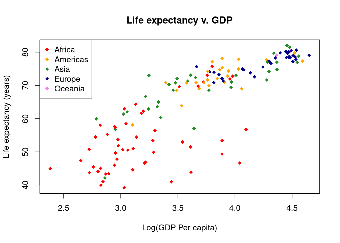
Prevent mistakes
Abstract the code
When writing code, abstraction can be quite useful, to ensure consistency throughout your code.
# Graphing Life Expectancy vs. GDP
# Jeffrey C. Oliver
# jcoliver@email.arizona.edu
# 2016-11-15

# Read in data
all_gapminder <- read.csv(file = "data/gapminder-FiveYearData.csv",
                          stringsAsFactors = TRUE)

# Subset data
gapminder <- all_gapminder[all_gapminder$year == 2002, ]

# Make new vector of Log GDP
gapminder$Log10GDP <- log10(gapminder$gdpPercap)

# Store values to use for some plotting parameters
symbol <- 18
sym_size <- 1.2
continents <- levels(gapminder$continent)
continent_colors <- c("red", "orange", "forestgreen", "darkblue", "violet")

# Assign colors for each continent
gapminder$colors <- NA
gapminder$colors[gapminder$continent == continents[1]] <- continent_colors[1]
gapminder$colors[gapminder$continent == continents[2]] <- continent_colors[2]
gapminder$colors[gapminder$continent == continents[3]] <- continent_colors[3]
gapminder$colors[gapminder$continent == continents[4]] <- continent_colors[4]
gapminder$colors[gapminder$continent == continents[5]] <- continent_colors[5]

# Create main plot
plot(x = gapminder$Log10GDP,
     y = gapminder$lifeExp,
     main = "Life expectancy v. GDP",
     xlab = "Log(GDP Per capita)",
     ylab = "Life expectancy (years)",
     col = gapminder$colors,
     pch = symbol,
     cex = sym_size,
     lwd = 1.5)

# Add a legend - we don't have to worry about getting the colors
# in the right order because we are using the same vector that we used
# when assigning colors in the first place.
legend("topleft",
       legend = continents,
       col = continent_colors,
       pch = symbol)

# Add a regression line
lifeExp_lm <- lm(gapminder$lifeExp ~ gapminder$Log10GDP)
abline(reg = lifeExp_lm, lty = 2, lwd = 2)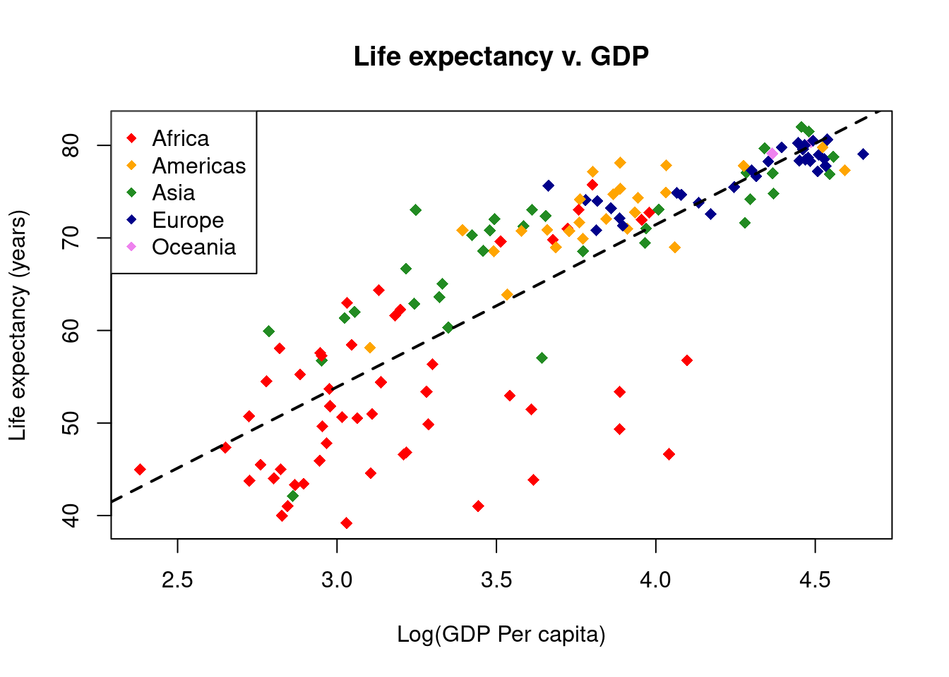
Even fewer mistakes via less code o.O
More code abstraction & loops
Continuing with abstraction, we can simplify our code with control flow - here we use a for loop to accomplish the color assignment task.
# Graphing Life Expectancy vs. GDP
# Jeffrey C. Oliver
# jcoliver@email.arizona.edu
# 2016-11-15

# Read in data
all_gapminder <- read.csv(file = "data/gapminder-FiveYearData.csv",
                          stringsAsFactors = TRUE)

# Subset data
gapminder <- all_gapminder[all_gapminder$year == 2002, ]

# Make new vector of Log GDP
gapminder$Log10GDP <- log10(gapminder$gdpPercap)

# Store values to use for some plotting parameters
symbol <- 18
sym_size <- 1.2
continents <- levels(gapminder$continent)
continent_colors <- c("red", "orange", "forestgreen", "darkblue", "violet")

# Establish empty column to store colors
gapminder$colors <- NA
# Loop over continents and assign colors
for (i in 1:length(continents)) {
  gapminder$colors[gapminder$continent == continents[i]] <- continent_colors[i]
}

# Create main plot
plot(x = gapminder$Log10GDP,
     y = gapminder$lifeExp,
     main = "Life expectancy v. GDP",
     xlab = "Log(GDP Per capita)",
     ylab = "Life expectancy (years)",
     col = gapminder$colors,
     pch = symbol,
     cex = sym_size)

# Add a legend
legend("topleft",
       legend = continents,
       col = continent_colors,
       pch = symbol)

# Add a regression line
lifeExp_lm <- lm(gapminder$lifeExp ~ gapminder$Log10GDP)
abline(reg = lifeExp_lm, lty = 2, lwd = 2)
Saving graphical output
Redirect graphics to PDF file
To save the file, we can redirect the output to a graphics device. In this example we use a PDF writer; many other graphics devices are availble for writing different file formats, including svg, jpeg, and png.
# Graphing Life Expectancy vs. GDP
# Jeffrey C. Oliver
# jcoliver@email.arizona.edu
# 2016-11-15

# Read in data
all_gapminder <- read.csv(file = "data/gapminder-FiveYearData.csv",
                          stringsAsFactors = TRUE)

# Subset data
gapminder <- all_gapminder[all_gapminder$year == 2002, ]

# Make new vector of Log GDP
gapminder$Log10GDP <- log10(gapminder$gdpPercap)

# Store values to use for some plotting parameters
symbol <- 18
sym_size <- 1.2
continents <- levels(gapminder$continent)
continent_colors <- c("red", "orange", "forestgreen", "darkblue", "violet")

# Create new vector for colors
gapminder$colors <- NA
# Loop over continents and assign colors
for (i in 1:length(continents)) {
  gapminder$colors[gapminder$continent == continents[i]] <- continent_colors[i]
}

# Open PDF device
pdf(file = "output/Life_expectancy_graph.pdf", useDingbats = FALSE)
# Create main plot
plot(x = gapminder$Log10GDP,
     y = gapminder$lifeExp,
     main = "Life expectancy v. GDP",
     xlab = "Log(GDP Per capita)",
     ylab = "Life expectancy (years)",
     col = gapminder$colors,
     pch = symbol,
     cex = sym_size)

# Add a legend
legend("topleft",
       legend = continents,
       col = continent_colors,
       pch = symbol)

# Add a regression line
lifeExp_lm <- lm(gapminder$lifeExp ~ gapminder$Log10GDP)
abline(reg = lifeExp_lm, lty = 2, lwd = 2)

# Close PDF device
dev.off()
Automation!
Make 12 separate PDF graphs
Finally (well, almost finally, see below), we can automate this process to create a separate PDF of the same graph for each year of data in the gapminder datasets (there are 12 years of data for each country).
# Graphing Life Expectancy vs. GDP
# Jeffrey C. Oliver
# jcoliver@email.arizona.edu
# 2016-11-15

# Read in data
all_gapminder <- read.csv(file = "data/gapminder-FiveYearData.csv",
                          stringsAsFactors = TRUE)

# Hold off on subsetting the data
# Make new vector of Log GDP
all_gapminder$Log10GDP <- log10(all_gapminder$gdpPercap)

# Store values to use for some plotting parameters
symbol <- 18
sym_size <- 1.2
continents <- levels(all_gapminder$continent)
continent_colors <- c("red", "orange", "forestgreen", "darkblue", "violet")

# Create new vector for colors
all_gapminder$colors <- NA
# Loop over continents and assign colors
for (i in 1:length(continents)) {
  all_gapminder$colors[all_gapminder$continent == continents[i]] <- continent_colors[i]
}

# Find the unique values in the all_gapminder$year vector
years <- unique(all_gapminder$year)

# Now loop over each of the different years to create the PDFs.
for (curr_year in years) {
  # Subset data
  gapminder_one_year <- all_gapminder[all_gapminder$year == curr_year, ]

  # Open PDF device
  filename <- paste0("output/Life_exp_", curr_year, "_graph.pdf")
  pdf(file = filename, useDingbats = FALSE)
  # Create main plot
  plot(x = gapminder_one_year$Log10GDP,
       y = gapminder_one_year$lifeExp,
       main = "Life expectancy v. GDP",
       sub = curr_year,
       xlab = "Log(GDP Per capita)",
       ylab = "Life expectancy (years)",
       col = gapminder_one_year$colors,
       pch = symbol,
       cex = sym_size,
       lwd = 1.5)

  # Add a legend
  legend("topleft",
         legend = continents,
         col = continent_colors,
         pch = symbol)

  # Add a regression line
  lifeExp_lm <- lm(gapminder_one_year$lifeExp ~ gapminder_one_year$Log10GDP)
  abline(reg = lifeExp_lm, lty = 2, lwd = 2)

  # Close PDF device
  dev.off()
}
Advanced topic: making it even prettier
Add transparency to points
And for advanced users, we can add some transparency to the points (skipping the step were the plot is saved to a PDF file).
# Graphing Life Expectancy vs. GDP
# Jeffrey C. Oliver
# jcoliver@email.arizona.edu
# 2016-11-15

# Read in data
all_gapminder <- read.csv(file = "data/gapminder-FiveYearData.csv",
                          stringsAsFactors = TRUE)

# Subset data
gapminder <- all_gapminder[all_gapminder$year == 2002, ]

# Make new vector of Log GDP
gapminder$Log10GDP <- log10(gapminder$gdpPercap)

# Store values to use for some plotting parameters
symbol <- 18
sym_size <- 1.2
continents <- levels(gapminder$continent)
continent_colors <- c("red", "orange", "forestgreen", "darkblue", "violet")
To add transparency, color names will not be enough - we will have to use RGB values and add an alpha (transparency) value. Start by using the col2rgb function to see what the red, green, and blue values are for our five colors.
# Investigating colors
col2rgb(continent_colors)
[,1] [,2] [,3] [,4] [,5]
red 255 255 34 0 238
green 0 165 139 0 130
blue 0 0 34 139 238In this output, we see that each column corresponds to a color in our continents_colors vector (first column corresponds to “red”, second column corresponds to “orange”, etc.). Each row corresponds to one of the three primary colors.
# Convert colors to RGB, so we can add an alpha (transparency) value
continent_rgb <- col2rgb(continent_colors)
continent_colors <- NULL
opacity <- 150
# Loop over each column (i.e. color) in continent_rgb and extract Red, Green,
# and Blue values
for (color_column in 1:ncol(continent_rgb)) {
  new_color <- rgb(red = continent_rgb['red', color_column],
                   green = continent_rgb['green', color_column],
                   blue = continent_rgb['blue', color_column],
                   alpha = opacity,
                   maxColorValue = 255)
  continent_colors[color_column] <- new_color
}

# Create new vector for colors
gapminder$colors <- NA
# loop over continents and assign colors
for (i in 1:length(continents)) {
  gapminder$colors[gapminder$continent == continents[i]] <- continent_colors[i]
}

# Create main plot
plot(x = gapminder$Log10GDP,
     y = gapminder$lifeExp,
     main = "Life expectancy v. GDP",
     xlab = "Log(GDP Per capita)",
     ylab = "Life expectancy (years)",
     col = gapminder$colors,
     bg = gapminder$colors,
     pch = symbol,
     cex = sym_size,
     lwd = 1.5)

# Add a legend
legend("topleft",
       legend = continents,
       col = continent_colors,
       pch = symbol)

# Add a regression line
lifeExp_lm <- lm(gapminder$lifeExp ~ gapminder$Log10GDP)
abline(reg = lifeExp_lm, lty = 2, lwd = 2)![]()
Additional resources
- For advanced graphing, the ggplot2 package is extremely useful. A companion lesson for using ggplot2 is available at https://jcoliver.github.io/learn-r/004-intro-ggplot.html.
- A PDF version of this lesson