dir.create(path = "data")
dir.create(path = "output")Introduction to data visualization with ggplot
An introduction to using the ggplot package in R to produce publication-quality graphics.
Learning objectives
- Install and use third-party packages for R
- Use layering to add elements to a plot
- Format plots with faceting
Setup
Workspace organization
First we need to setup our development environment. Open RStudio and create a new project via:
- File > New Project…
- Select ‘New Directory’
- For the Project Type select ‘New Project’
- For Directory name, call it something like “r-graphing” (without the quotes)
- For the subdirectory, select somewhere you will remember (like “My Documents” or “Desktop”)
We need to create two folders: ‘data’ will store the data we will be analyzing, and ‘output’ will store the results of our analyses.
With this workspace organization, we can download the data, either manually or use R to automatically download it. For this lesson we’ll do the latter, saving the file in the data directory we just created, and name the file gapminder.csv:
download.file(url = "http://tinyurl.com/gapminder-five-year-csv",
              destfile = "data/gapminder.csv")
From this point on, we want to keep track of what we have done, so we will restrict our use of the console and instead use script files. Start a new script with some brief header information at the very top. We want, at the very least, to include:
- A short description of what the script does (no more than one line of text)
- Your name
- A means of contacting you (e.g. your e-mail address)
- The date, preferably in ISO format YYYY-MM-DD
# Scatterplot of gapminder data
# Jeff Oliver
# jcoliver@email.arizona.edu
# 2017-02-23
Installing additional packages
There are two steps to using additional packages in R:
- Install the package through
install.packages() - Load the package into active memory with
library()
For this exercise, we will install the ggplot2 package:
install.packages("ggplot2")
library("ggplot2")
It is important to note that for each computer you work on, the install.packages command need only be issued once, while the call to library will need to be issued for each session of R. Because of this, it is standard convention in scripts to comment out the install.packages command once it has been run on the machine, so our script now looks like:
# Scatterplot of gapminder data
# Jeff Oliver
# jcoliver@email.arizona.edu
# 2017-02-23

#install.packages("ggplot2")
library("ggplot2")
Now plot!
Scatterplot
For our first plot, we will create an X-Y scatterplot to investigate a potential relationship between a country’s gross domestic product (GDP) and the average life expectancy. We ultimately want a plot that looks like:

We do so by first reading in the data we downloaded, then creating a ggplot object, and finally printing the plot by running the line of code with just the name of the variable in which our plot is stored:
# Load data
gapminder <- read.csv(file = "data/gapminder.csv",
                      stringsAsFactors = TRUE)

# Create plot object
lifeExp_plot <- ggplot(data = gapminder,
                       mapping = aes(x = gdpPercap, y = lifeExp))

# Draw plot
lifeExp_plot![]()
What happened? There are no points!? Here is where functionality of ggplot is evident. The way it works is by effectively drawing layer upon layer of graphics. So we have established the plot, but we need to add one more bit of information to tell ggplot what to put in that plot area. For a scatter plot, we use geom_point(), literally adding this to the ggplot object with a plus sign (+):
# Create plot object
lifeExp_plot <- ggplot(data = gapminder,
                       mapping = aes(x = gdpPercap, y = lifeExp)) +
  geom_point()

# Draw plot
lifeExp_plot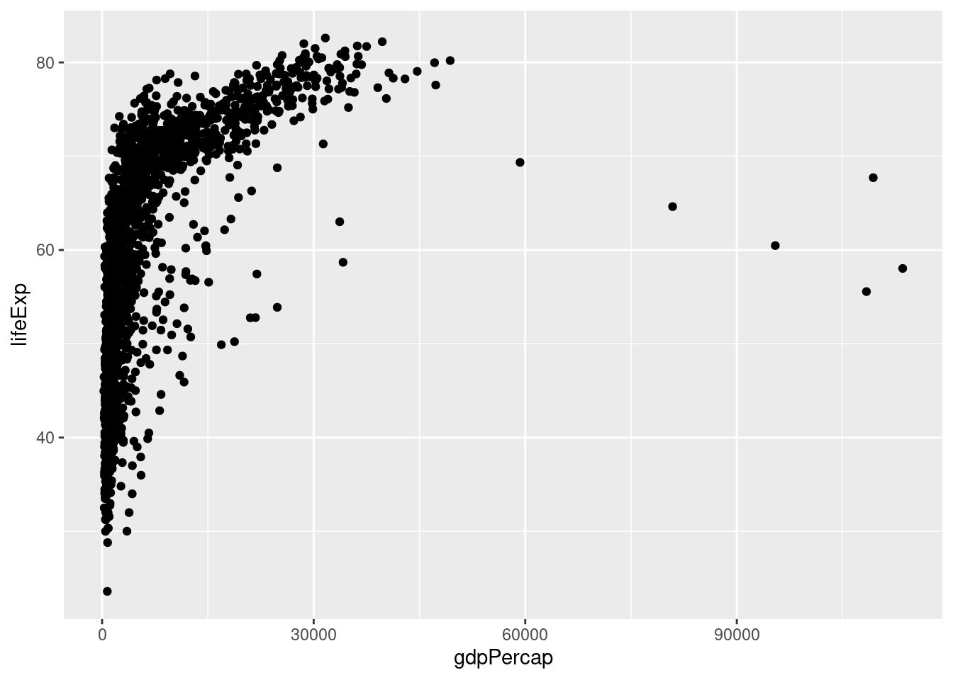
It is a little difficult to see how the points are distributed, as most are clustered on the left-hand side of the graph. To spread this distribution out, we can change the scale of the x-axis so GDP is displayed on a log scale by adding scale_x_log10:
# Create plot object
lifeExp_plot <- ggplot(data = gapminder,
                       mapping = aes(x = gdpPercap, y = lifeExp)) +
  geom_point() +
  scale_x_log10()

# Draw plot
lifeExp_plot 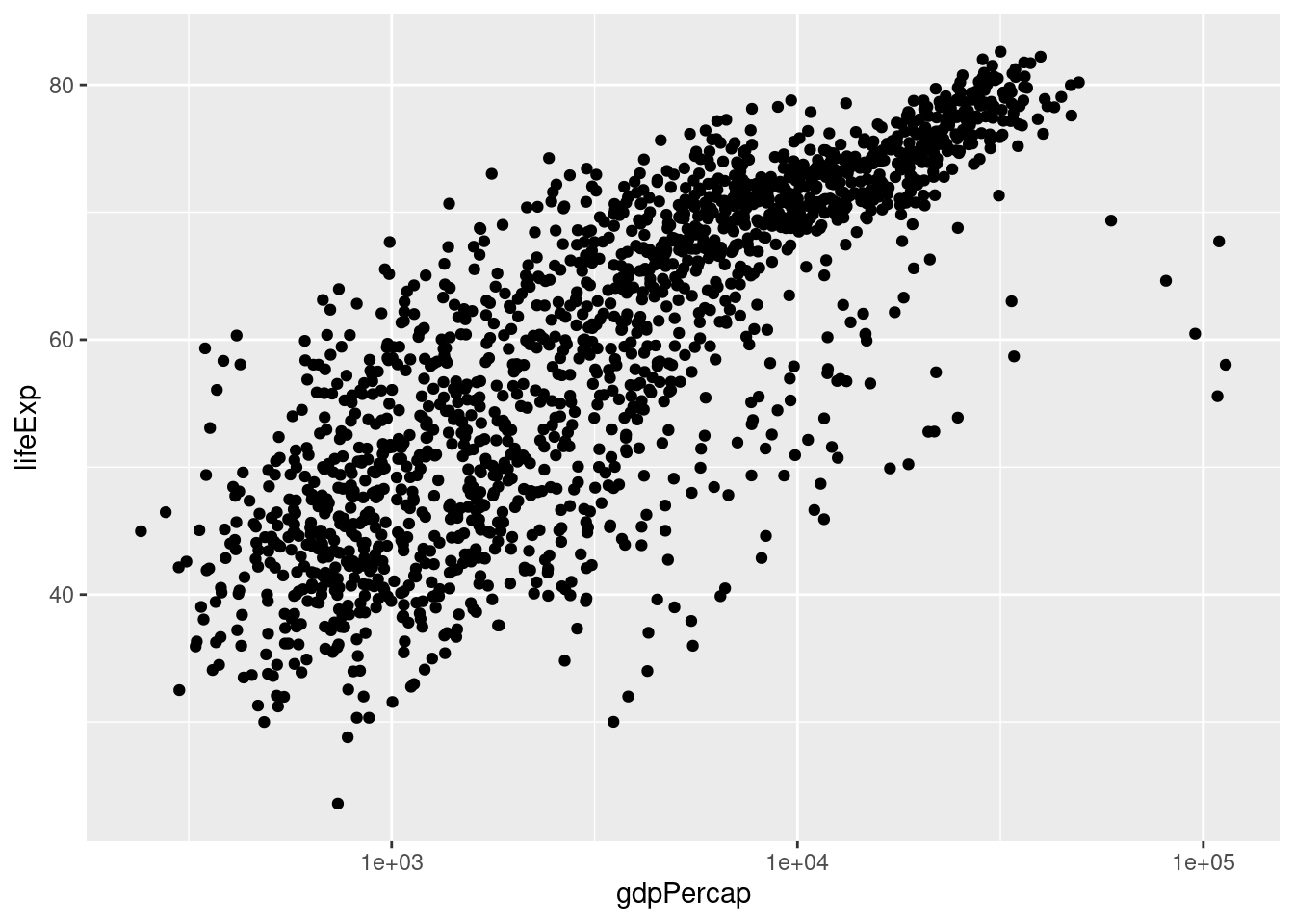
One thing of interest is to include additional information in the plot, such as which continent each point comes from. We can color points by another value in our data through the aes parameter in the initial call to ggplot. So in addition to telling R which data to use for the x and y axes, we indicate which data to use for point colors:
# Create plot object
lifeExp_plot <- ggplot(data = gapminder,
                       mapping = aes(x = gdpPercap,
                                     y = lifeExp,
                                     color = continent)) +
  geom_point() +
  scale_x_log10()

# Draw plot
lifeExp_plot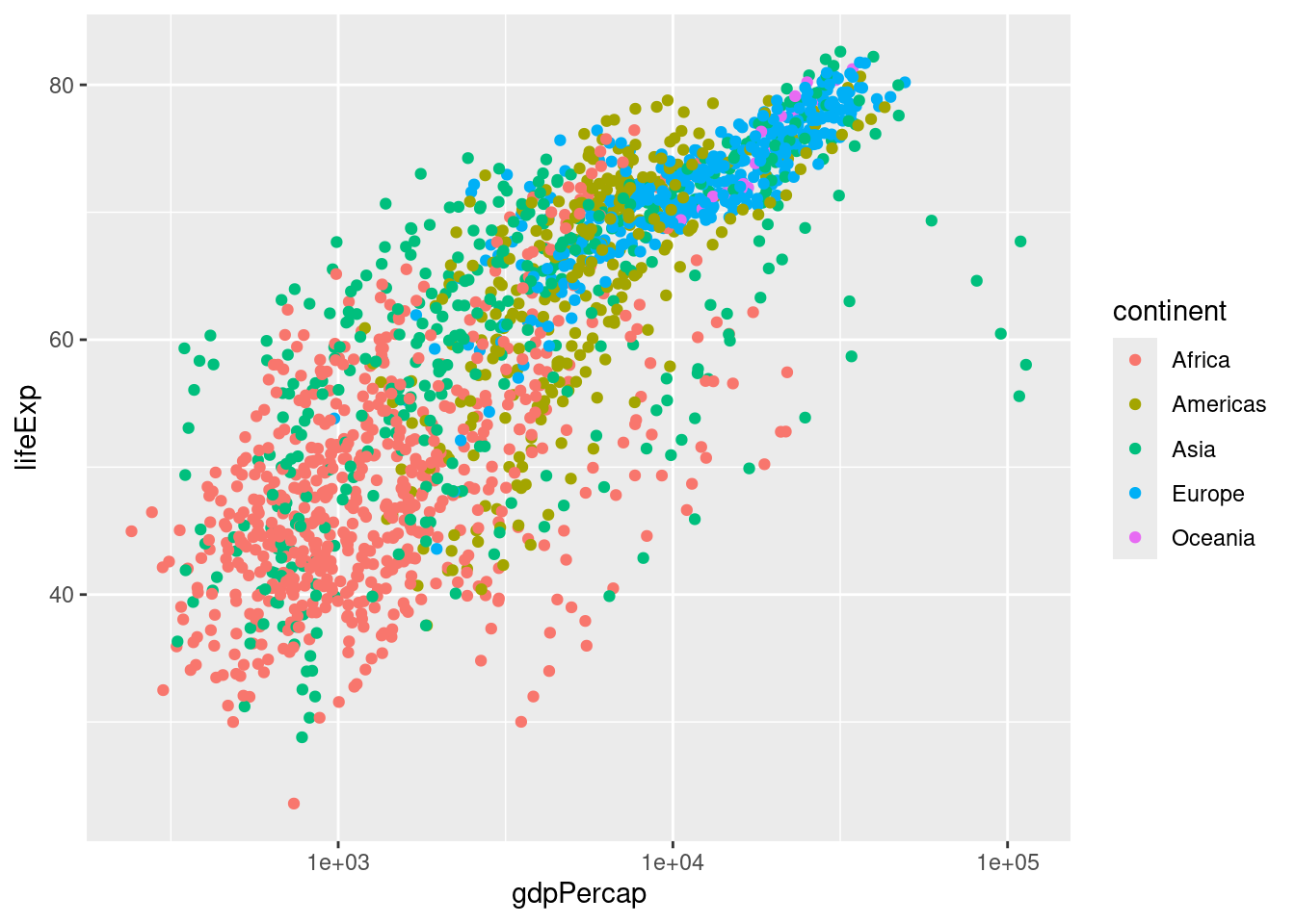
At this point, we want to change the colors of the points in two ways: (1) we want to make them slightly transparent because there is considerable overlap in some part of the graph; we do this by setting the alpha parameter in the geom_point call; (2) we want to use custom colors for each continent; this is done with the scale_color_manual function:
# Create plot object
lifeExp_plot <- ggplot(data = gapminder,
                       mapping = aes(x = gdpPercap,
                                     y = lifeExp,
                                     color = continent)) +
  geom_point(alpha = 0.5) +
  scale_x_log10() +
  scale_color_manual(values = c("red", "orange", "forestgreen",
                                "darkblue", "violet"))

# Draw plot
lifeExp_plot![]()
Finally, we should make those axis labels a little nicer.
# Create plot object
lifeExp_plot <- ggplot(data = gapminder,
                       mapping = aes(x = gdpPercap,
                                     y = lifeExp,
                                     color = continent)) +
  geom_point(alpha = 0.5) +
  scale_x_log10() +
  scale_color_manual(values = c("red", "orange", "forestgreen",
                                "darkblue", "violet")) +
  xlab("GDP per capita") +
  ylab("Life Expectancy")

# Draw plot
lifeExp_plot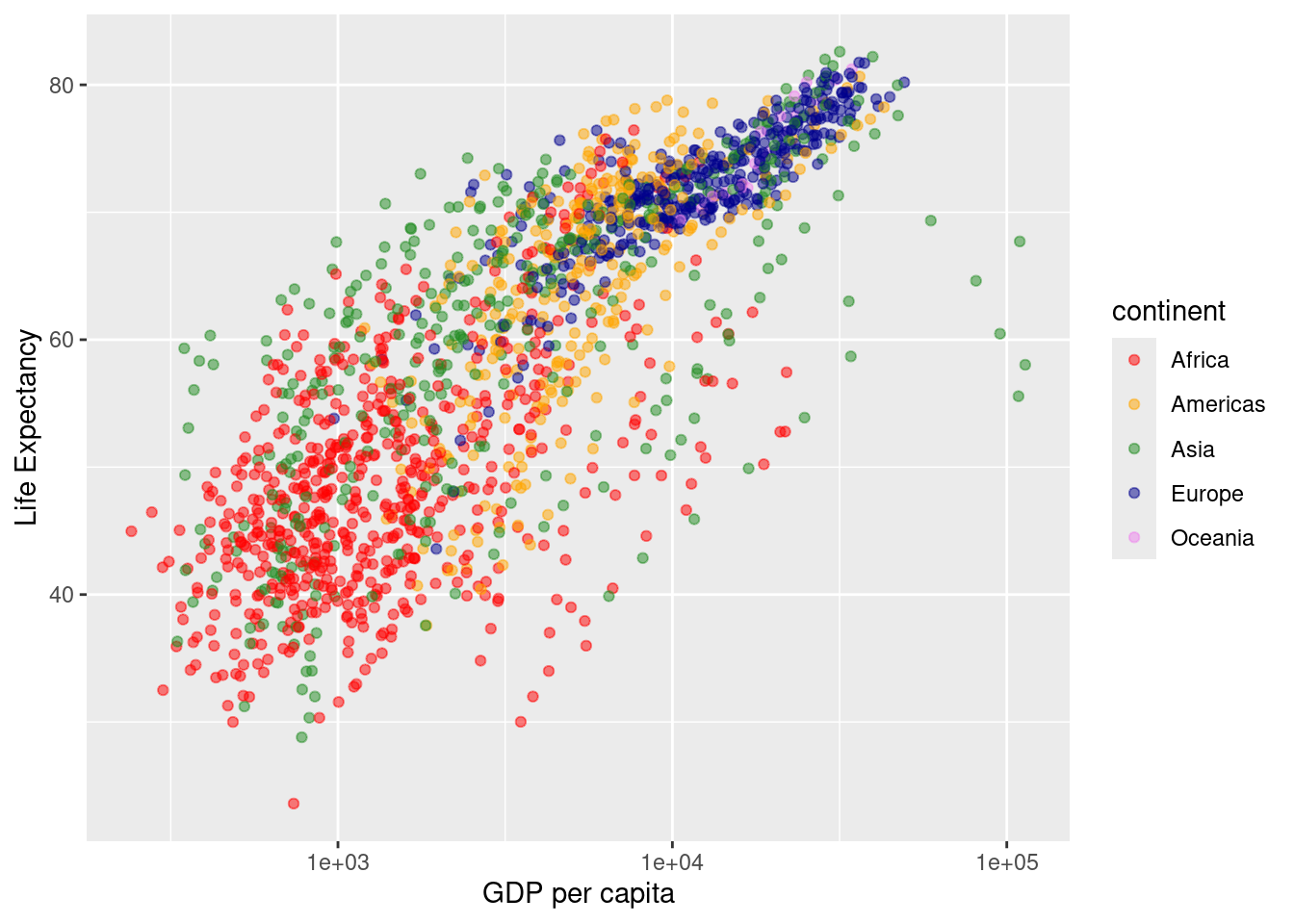
And if we want to save the plot to a file, we call ggsave, passing a filename and the plot object we want to save (the latter is optional, if we don’t indicate which plot to save, ggsave will save the last plot that was displayed):
# Save plot to png file
ggsave(filename = "output/gdp-lifeExp-plot.png", plot = lifeExp_plot)
Also note that ggsave will guess the type of file to save from the extension. For example, if we instead wanted to save a TIF instead of a PNG, we change the extension for the filename argument:
# Save plot to tif file
ggsave(filename = "output/gdp-lifeExp-plot.tiff", plot = lifeExp_plot)
Our final script for this scatterplot is then:
# Scatterplot of gapminder data
# Jeff Oliver
# jcoliver@email.arizona.edu
# 2017-02-23

#install.packages("ggplot2")
library("ggplot2")

# Load data
gapminder <- read.csv(file = "data/gapminder.csv",
                      stringsAsFactors = TRUE)

# Create plot object
lifeExp_plot <- ggplot(data = gapminder,
                       mapping = aes(x = gdpPercap,
                                     y = lifeExp,
                                     color = continent)) +
  geom_point(alpha = 0.5) +
  scale_x_log10() +
  scale_color_manual(values = c("red", "orange", "forestgreen",
                                "darkblue", "violet")) +
  xlab("GDP per capita") +
  ylab("Life Expectancy")

# Draw plot
lifeExp_plot

# Save plot to png file
ggsave(filename = "output/gdp-lifeExp-plot.png", plot = lifeExp_plot)
Violin plot
# Violin plot of GDP data
# Jeff Oliver
# jcoliver@email.arizona.edu
# 2017-02-23

#install.packages("ggplot2")
library("ggplot2")
In the spirit of reproducibility, we would like this script to be able to run and not depend on variables being loaded from other scripts. So, we want to start by loading the those gapminder data. To create a violin plot, we use the same approach as for a boxplot, but instead of geom_point, we use geom_violin:
# Load data
gapminder <- read.csv(file = "data/gapminder.csv",
                      stringsAsFactors = TRUE)

# Create violin plot object
gdp_plot <- ggplot(data = gapminder,
                   mapping = aes(x = continent, y = gdpPercap)) +
  geom_violin()

# Print plot
gdp_plot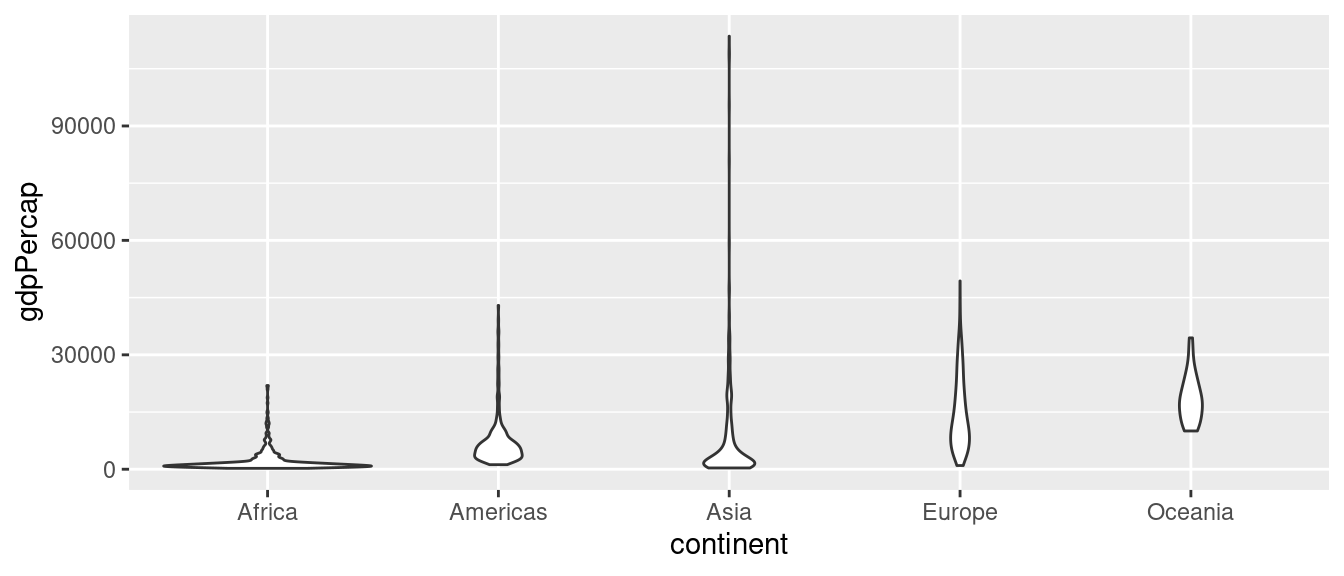
A good start, but we can see we need to clean some things up. We’ll start by changing the Y-axis to a log scale with scale_y_log10 and adding a nicer looking axis title with ylab. Also, we will remove the gray background that comes with the default theme by using theme_bw:
# Create violin plot object
gdp_plot <- ggplot(data = gapminder,
                   mapping = aes(x = continent, y = gdpPercap)) +
  geom_violin() +
  scale_y_log10() +
  ylab("GDP per capita") +
  theme_bw()

# Print plot
gdp_plot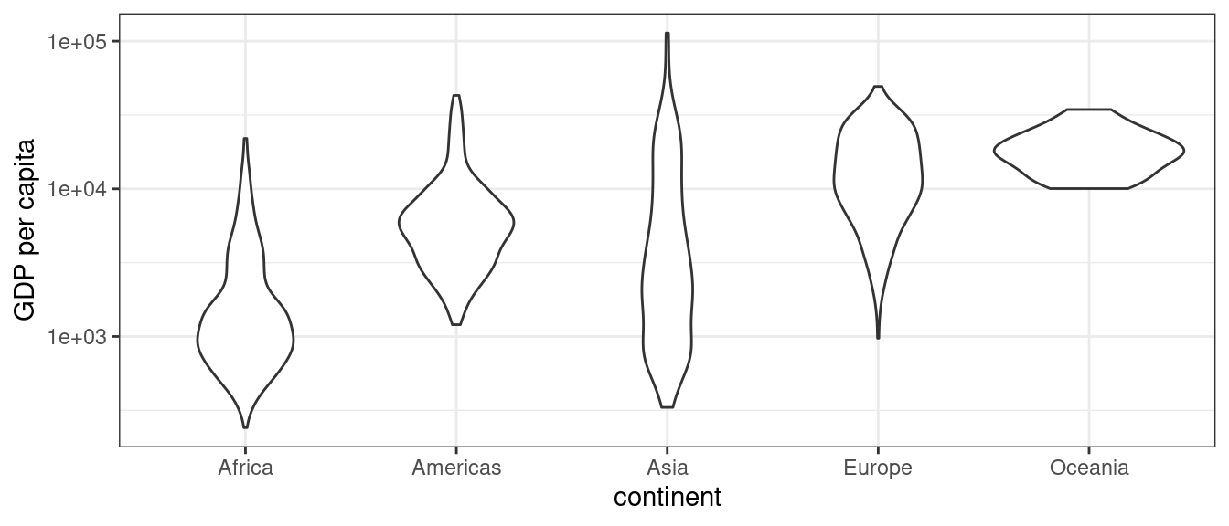
One of the issues we have in the plot is not obvious just by looking at it. If we take a look at the data using summary, note the values in the year vector:
summary(gapminder) country year pop continent
Afghanistan: 12 Min. :1952 Min. :6.001e+04 Africa :624
Albania : 12 1st Qu.:1966 1st Qu.:2.794e+06 Americas:300
Algeria : 12 Median :1980 Median :7.024e+06 Asia :396
Angola : 12 Mean :1980 Mean :2.960e+07 Europe :360
Argentina : 12 3rd Qu.:1993 3rd Qu.:1.959e+07 Oceania : 24
Australia : 12 Max. :2007 Max. :1.319e+09
(Other) :1632
lifeExp gdpPercap
Min. :23.60 Min. : 241.2
1st Qu.:48.20 1st Qu.: 1202.1
Median :60.71 Median : 3531.8
Mean :59.47 Mean : 7215.3
3rd Qu.:70.85 3rd Qu.: 9325.5
Max. :82.60 Max. :113523.1
There are actually multiple years of data (1952 - 2007, at five year increments). So rather than plotting GDP for all years together, we should separate out each year of data. The ggplot2 package makes this very easy with faceting. To break the data apart into separate graphs for each year, we use facet_wrap, passing year as the column in the gapminder data we want to use for each graph:
# Create violin plot object
gdp_plot <- ggplot(data = gapminder,
                   mapping = aes(x = continent, y = gdpPercap)) +
  geom_violin() +
  scale_y_log10() +
  ylab("GDP per capita") +
  theme_bw() +
  facet_wrap(~ year)

# Print plot
gdp_plot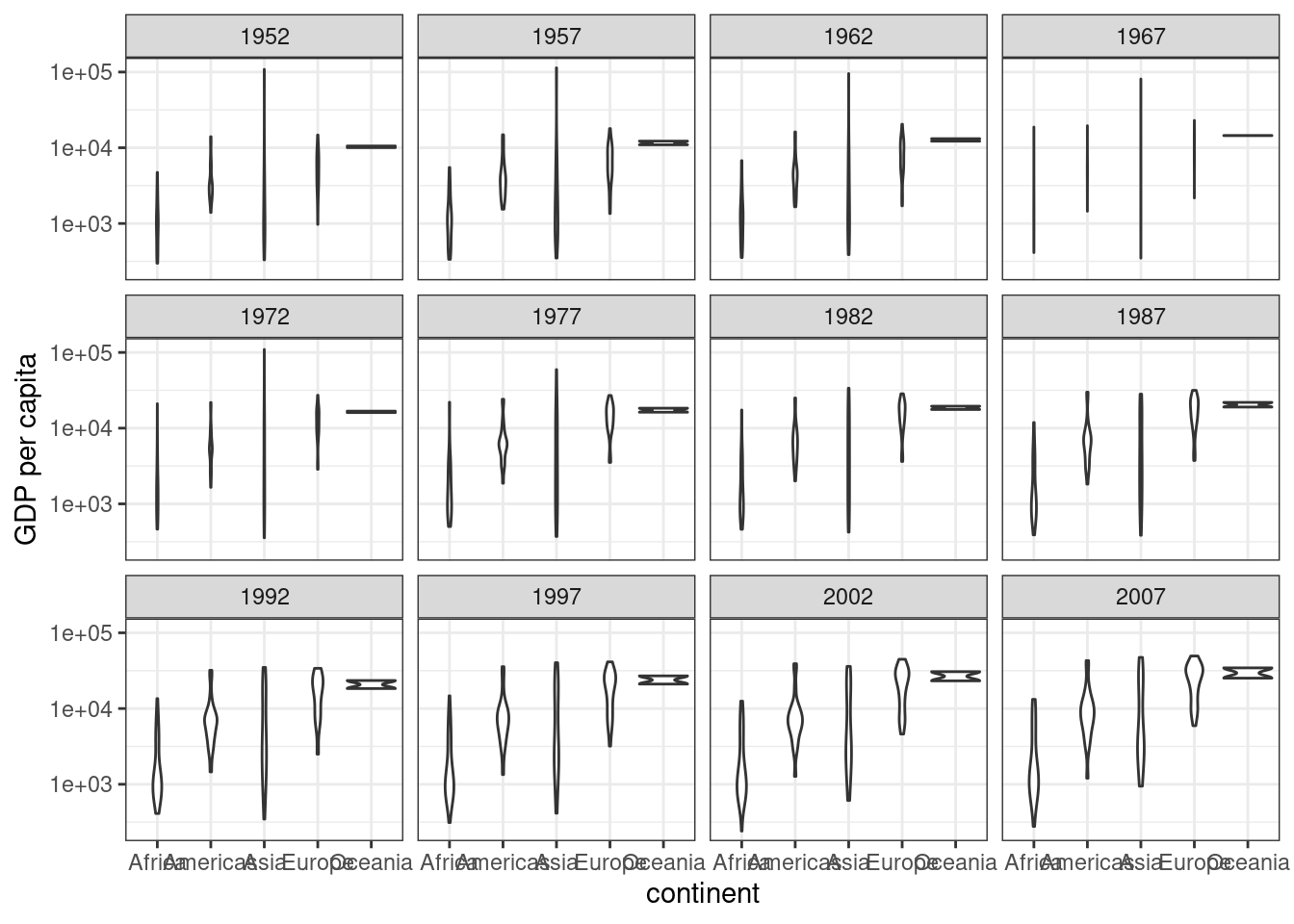
One of the first things you might notice is that the X-axis is way to crowded now. Instead of using text to indicate each continent, we could instead use a separate color to indicate each continent, like we did in the scatterplot. We’ll use scale_fill_manual for this purpose, and use the theme function to indicate that we do not want any x-axis text or an x-axis title.
# Create violin plot object
gdp_plot <- ggplot(data = gapminder,
                   mapping = aes(x = continent, y = gdpPercap)) +
  geom_violin() +
  scale_y_log10() +
  ylab("GDP per capita") +
  theme_bw() +
  facet_wrap(~ year) +
  scale_fill_manual(values = c("red", "orange", "forestgreen",
                               "darkblue", "violet")) +
  theme(axis.text.x = element_blank(),
        axis.title.x = element_blank())

# Print plot
gdp_plot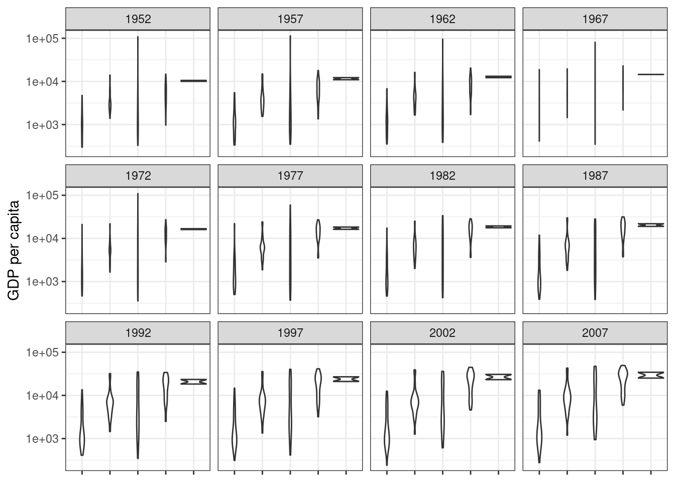
Okay, the x-axis is cleaned up, but where are the colors? If we look at our code, note that we said what colors we wanted, but not what they corresponded to. We need to explicitly tell ggplot that we want to fill the shapes by continent; this happens in the very first ggplot call, by passing an additional argument, fill to the aes function:
# Create violin plot object
gdp_plot <- ggplot(data = gapminder,
                   mapping = aes(x = continent,
                                 y = gdpPercap,
                                 fill = continent)) +
  geom_violin() +
  scale_y_log10() +
  ylab("GDP per capita") +
  theme_bw() +
  facet_wrap(~ year) +
  scale_fill_manual(values = c("red", "orange", "forestgreen",
                               "darkblue", "violet")) +
  theme(axis.text.x = element_blank(),
        axis.title.x = element_blank())

# Print plot
gdp_plot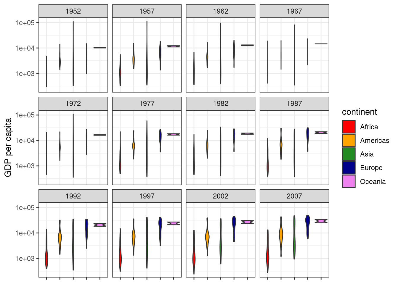
Colors! But what’s that funny violet shape on the right-hand side of each plot? Remember we assigned the violet color to our Oceania countries. The problem is that there are only two countries in Oceania: Australia and New Zealand. We cannot really do a violin plot with only two points, so for this plot, we are going to go ahead and explicitly omit the Oceania data from the plot. We do this by subsetting the gapminder data in the ggplot call and reducing the number of colors to use to five:
# Load data
gapminder <- read.csv(file = "data/gapminder.csv",
                      stringsAsFactors = TRUE)

# Create violin plot object, excluding Oceania countries
gdp_plot <- ggplot(data = gapminder[gapminder$continent != "Oceania", ],
                   mapping = aes(x = continent, y = gdpPercap, fill = continent)) +
  geom_violin() +
  scale_y_log10() +
  ylab("GDP per capita") +
  theme_bw() +
  facet_wrap(~ year) +
  scale_fill_manual(values = c("red", "orange", "forestgreen", "darkblue")) +
  theme(axis.text.x = element_blank(),
        axis.title.x = element_blank())

# Print plot
gdp_plot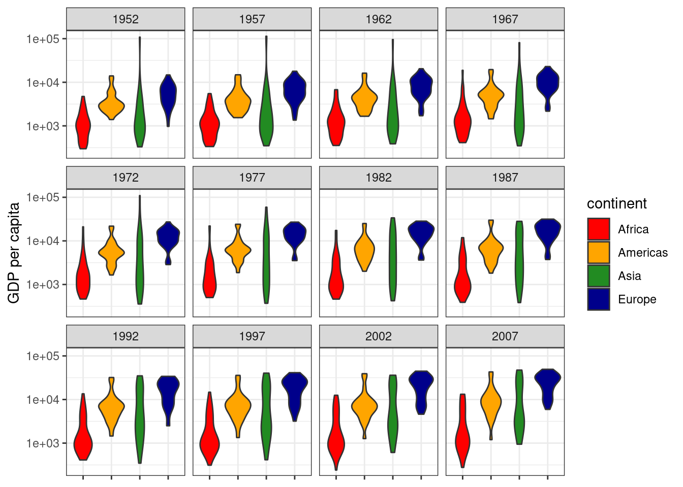
Success!
Our final script for this violin plot is then:
# Violin plot of GDP data
# Jeff Oliver
# jcoliver@email.arizona.edu
# 2017-02-23

#install.packages("ggplot2")
library("ggplot2")

# Load data
gapminder <- read.csv(file = "data/gapminder.csv",
                      stringsAsFactors = TRUE)

# Create violin plot object, excluding Oceania countries
gdp_plot <- ggplot(data = gapminder[gapminder$continent != "Oceania", ],
                   mapping = aes(x = continent, y = gdpPercap, fill = continent)) +
  geom_violin() +
  scale_y_log10() +
  ylab("GDP per capita") +
  theme_bw() +
  facet_wrap(~ year) +
  scale_fill_manual(values = c("red", "orange", "forestgreen", "darkblue")) +
  theme(axis.text.x = element_blank(),
        axis.title.x = element_blank())

# Print plot
gdp_plot
Additional resources
- Official ggplot documentation
- A handy cheatsheet for ggplot
- A PDF version of this lesson